
|
NB: This article was originally written in 2001/2, so many of the links will now be dead. My email is now rjthorne@blueyonder.co.uk Mapping Article: How to Make Rooms Look Good Introduction This article was mainly written for the benefit of newer mappers who want to improve their mapping skills. For the example map, I have used the game Quake, and the editor WorldCraft, but I don't see a reason why everything included shouldn't apply for any game or editor. For those interested, WorldCraft 1.6 can be downloaded here, or for the more recent version used in Halflife; WC3.3- visit the official site. In more detail, this article provides a step-by-step example-based guide to the construction of a single room, and how to make it look visually appealing, with hints to pick up and pictures to provide visual aid. By no means do I consider it to be the ultimate guide, but I do feel it gets across some of the points I take into account when creating my own maps. NOTE: This article doesn't cover the very basics of mapping and editors, such as definitions, mapping procedures, and so on; you really need to be confident working in the editor for this guide to be of much use. Guides for such beginners' needs can be found in the editor's help documents. So, you've just opened the editor and are staring at a blank screen wandering what to try and make... Creativity plays a big role in mapping for the more innovative type, but until you've gotten a few quality releases out the door, such wacky settings as in Elek's "Soulstice", CZG's "Numb Nimbus", or Necros' "The Emptiness Without" aren't worth considering; you want to begin with the basic. That doesn't, however, mean that the basic shouldn't still be of great quality. By basic, I mean rooms. Simple rooms which start out as boxes and are connected with corridors. These rooms and corridors should all be different, of course, and span various storeys; you'll probably want to include an impressive front-section and outdoor area among these too. But for now, we'll stick with a nice and simple room to kick the map off. The first thing that needs deciding is a texture theme. In older games such as Quake, stock textures can be difficult to make the map look good, so you're best off opting for custom textures. In this example, I shall use IKbase, by Iikka Keranen. The next major step is to make that box; keeping to a large-scale grid as often as possible, the dimensions are 512*768*512 (X*Y*Z); a medium sized room for most games/gametypes. Texture choices are important here; the floor, wall, and ceiling textures should all be different, and should look the part - don't cover the wall in what looks like a floor, and vice-versa. Throw in a few ambient lights to provide something to work in, and add an exit doorway to each end, for something to connect the rest of the map to later on. That should leave you with one box-room. 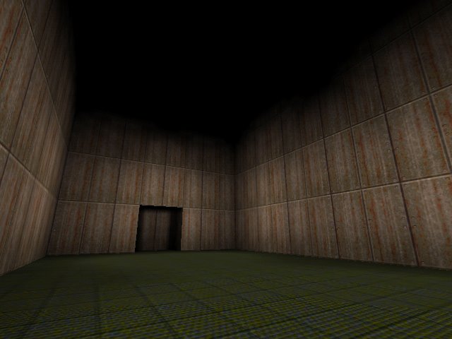 I decided to lower the ceiling after the first shot; so sue me =) The main thing that comes to mind in this shot is the lack of detail. Whilst any usual novice mapper would go about attempting to add the said 'detail' early on at this stage, the right thing to do is go about defining the rooms overall 'shape' first, before adding small-scale detail. Even a simple tactic like making a large part of each wall angled can do the trick, as displayed in the next shot... 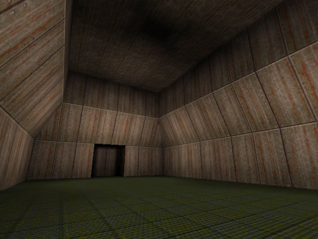 It's already starting to take a more clearly defined shape, and is a lot easier on the eye. Large-scale angles are certainly one thing not to avoid in mapping. It still looks utterly bland, though; there's no denying it. The first step of getting around blandness is texture variation. Try using different textures for different parts of the wall - experiment with a few combinations until you get something looking good. One thing to note is that detailed textures are better lower down, and less-detailed ones higher up. This is because the player will spend most of the time walking around on the floor, and will pay little attention to the walls higher up. Rooms like these should always be bottom-heavy for this reason. 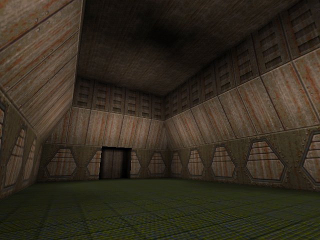 Here's the part where it starts to look like a proper room =) The only real error here is garingly obvious; textures should never be 'cut-off', like they are against the end doorway. This problem can be easily fixed without any need for alignment; simply split the wall either side of the doorway into two, leaving two extra 64-wide brushes against the doorway. Re-texture them in a large trim design and it should get around the problem fine... 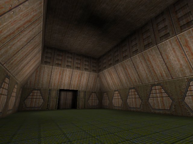 Now it's looking considerably better than before, but still bland. The reason for this is that the walls have only been split up (by using different textures) vertically, and not horizontally. Now, texturing one end of the room differently from the other would just look silly, in this case. However, the walls can be broken up with vertical strips, by using a large trim texture, as before with the one used to block off the repeating wall texture. Carrying that texture on upwards through the wall breaks the monotony perfectly... 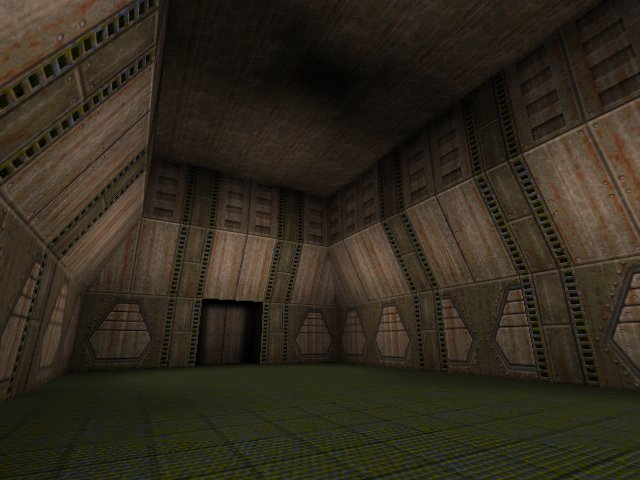 This is done by splitting the walls along various vertical margins, leaving extra brushes to apply the trim texture to. Two problems here, however; the first is the rather obvious texture mis-alignment on the wall to the right - easily fixable. The second is a little less obvious, but is still a problem. The vertical strips themselves look rather 'cut-off' against the ceiling, rather as if the ceiling was temporary and that the walls actually extend up further. This is resolved by a ceiling border. Select all the brushes in the top half and split them horizontally, leaving a set of 64-high brushes adjacent to the top. These can then be retextured to block off the wall-tops properly, making it look a lot more complete. 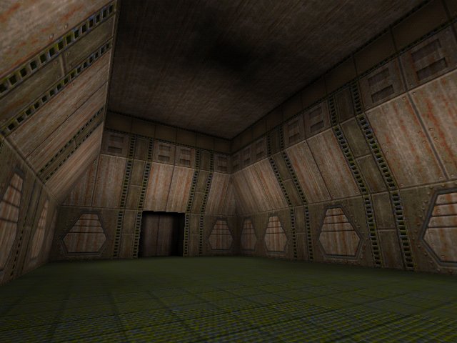 Detail aside, texturing is just about sorted for the time being. There is enough variation to keep things coherent and visually appealing. However, it's all too flat. Architecture plays an equally important role as texturing in making levels look cool. The cryingly obvious thing to do is to move the vertical strips outward, so they appear more like wall supports. This plays an important role in coherence, and makes the walls less flat/dull. 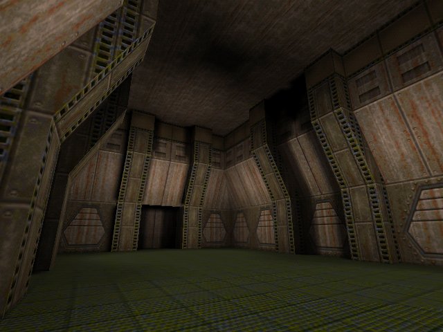 This is simply done by selecting all brushes in the vertical strips and dragging them inwards. Be careful for errors like this, also: 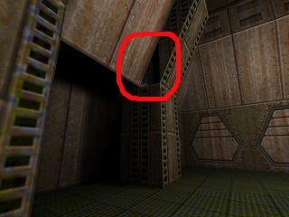 Be sure to plug all those little holes! The last thing you want are leaks. There are two other problems with the last main shot; one being the obvious mistake of not retexturing the sides of the wall-supports (do so with a small-tiling grainless texture if possible), the other being a familiar problem with regards to the ceiling. Despite them still being rounded off at the top with a different texture, the wall-supports still appear to go 'beyond' the ceiling, as it were. Extending the top brushes outwards by 16 units each way should fix this. 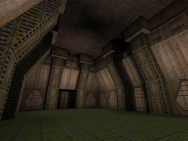 These top brushes now maintain the solid look, but look rather crude with the blockiness and the bad texture alignment. This problem is easily fixed through angles, yet again. Look at the comparison below: 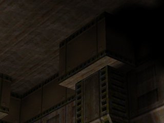
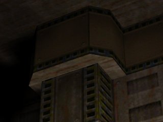 Cornering can fix texture alignment issues and make things look stylish. The only things I can think to add now, in terms of architecture, are a couple of ceiling bars to break up the ceiling: 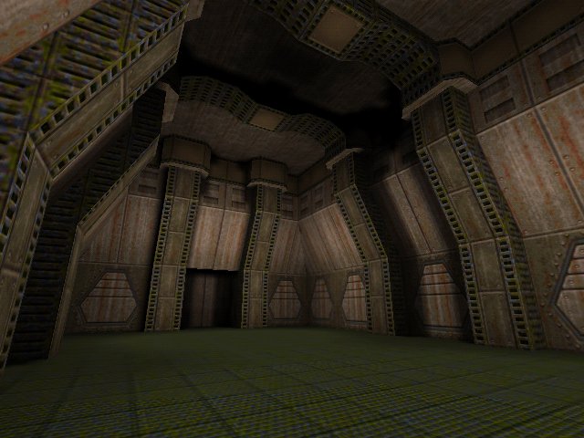 Ceiling detail should never be overlooked; it's one place where anything can go; the player can't get anywhere near it, so there's no worries about neatness and clutter up there - within reason, of course. Right, the overall architecture is looking fine now. Time for a little bit of detail - we can start with a few sourced lights...  See how much better it looks with the contrast from the light-textures? Contrast is something to aim for, providing it doesn't deviate from the theme too much. Other details that one might want could include floor-grates, crates, broken sections or small light fixtures. Maintaining the room's 'clean' look, crates and broken sections shan't be necessary, but floor-grates are easy to add, and work well in breaking up the floor area and making it look interesting, as I found in my own Q1DM map 'Trick or Treat'...  I sank the main area of the floor a bit cos I thought it looked cool - thank Scampie's Scampdm5 for this =) There are plenty of other types of detail to play around with, depending on the style of the map. One thing to remember though is stick to the type of design the game works best with (eg. lots of thinnish pokey designs and fixtures will look bad in Quake, given that it's alot more suited to heavier, solid designs). Okay dokay... lighting time! The light in this map sucks; it's basically just a few ambient entities scattered in at random. For a start, the overall light-levels need to be darkened to make the sourced light stand out more, and stronger value lights can be placed directly by the light-textures. (TIP: for Quake, use tyrlite, or some such modified light program, which allows you to set fade distance on lights; set it to values around 2-4 for lights to be as bright as you like without spreading too far.) 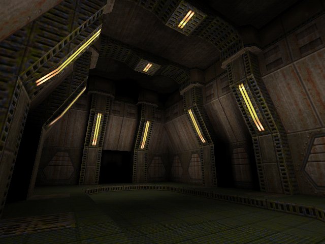 Almost there now... Remember those 'small light fixtures' I mentioned with regards to detail? The lighting on the lower walls still looks particularly bland, and could do with a few cunning effects. The lights used on them below are known as 'wall-washers', and with the small spotlights providing a source, it makes things look very atmospheric and downright cool indeed =) 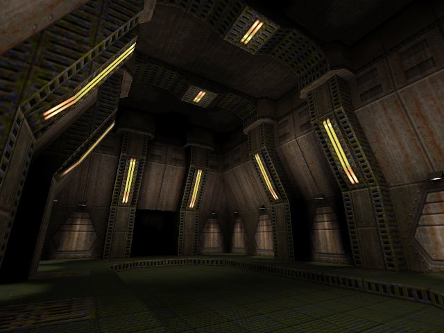 And there we have it! The only thing I think could be added, is a global minlight value to eliminate the black spots, but that's no real problem. Once the level is laden with entities it will look alot more at-home, too =) In attempting to describe why the end result looks good, I'd mention it's overall 'solid' and neat feel, with good use of angles, interesting and detailed lighting with ample visual contrast, and attention to detail rounding things up. Now all that's needed is connecting this room up to various others of a similar style, and then you have your map =) Appendix I sent this article off to four well-known, established mappers before releasing it, here's what they had to say; Vondur came up with an important point; the room is of a considerably high polycount, and when creating a full map, the mapper will have to be careful in adding 'visblocks', so that multiple rooms of high detail are not directly open to each other, as this will cause slowdown. Than approved, and suggested I highlight the error in the picture that now has an ugly red circle on it, so you can see what I was talking about =) Tyrann suggested that I should actually go by my own words and use a 'grainless' texture for texturing the sides of the wall-supports, as pictured below. This was an error I didn't really pick up on... 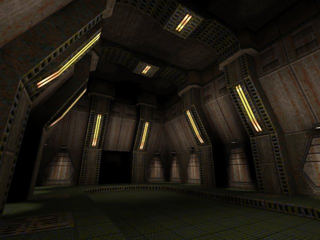 CZG also approved, but didn't really have much to say =) Comments & questions are welcome - contact me here: xenon@planetquake.com. You can download the example bsp and source.map for Quake1 here. ~xen |